Summary
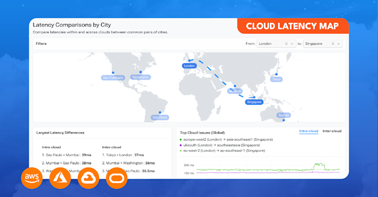
Today, we’re excited to announce the launch of Kentik’s Cloud Latency Map, a public service that uses Kentik Synthetics to continuously measure latency between the regions of the biggest cloud providers.
The Cloud Latency Map is the latest expression of Kentik’s dedication to extending network observability to the cloud. The Map is powered by a small army of software agents hosted in cloud regions around the world. These agents are capable of performing a range of monitoring functions and form the basis of Kentik Synthetics.
What is it?
The Cloud Latency Map is a free public tool that allows users to explore the latencies measured between over 100 different cloud regions worldwide. It can be used to compare latencies over common routes or identify recent changes in observed latencies between specified public clouds, cloud regions, or large geographic areas.
In cloud parlance, a “cloud region” refers to a geographic location where cloud services are hosted. A cloud region typically consists of multiple distinct data centers within a metropolitan area. In addition to hosting our agents in all of the regions of the big three public clouds (AWS, Azure, Google Cloud), we also host agents in the clouds of IBM and Oracle.
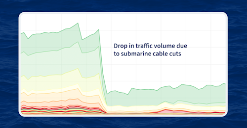
Broadly speaking, the tool can assist someone trying to determine if there is a connectivity issue impacting particular cloud regions. Additionally, since the public clouds rely on the same physical infrastructure as the rest of the global internet, the Map can often pick up on the latency impacts of failures of core infrastructure, such as the loss of a major submarine cable.
How do you use it?
There are two key components of the Cloud Latency Map: Latency Comparisons and Latency Changes. Before we get into these, let’s briefly discuss latency.
Typically, the primary factor contributing to latency between two faraway locations is distance. There is a theoretical upper limit for how fast data can travel down a fiber optic cable due to the speed of light. As a result, there is a minimum latency that can be achieved between any two locations. However, suboptimal routing can increase the distance traveled and thus increase the latency. Sustained excessive latency may cause problems for internet-based applications, but spikes in latency can often be indicative of other connectivity problems.
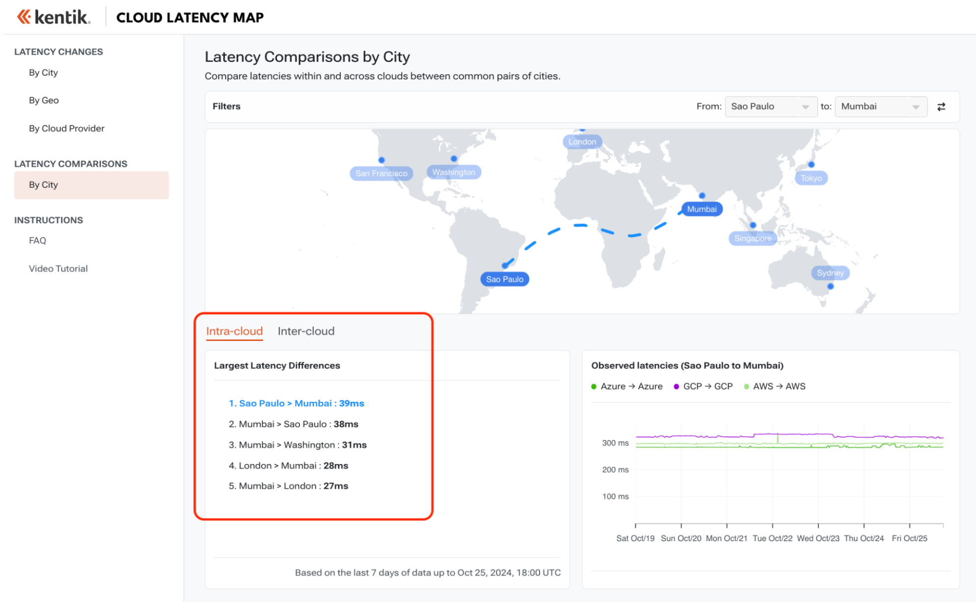
In the first component, Latency Comparisons, we compare latencies between any two of eight cities common to the three major public clouds (AWS, Azure, Google Cloud). This provides an “apples-to-apples” comparison as traffic has to traverse the same geographic distance between the two cities and can therefore highlight instances of persistent suboptimal routing. Within this view, there are two options: “Intra-cloud” and “Inter-cloud.”

Intra-cloud latencies are those performed between regions of the same cloud, while Inter-cloud latencies are based on measurements between different clouds. As one might expect, the Inter-cloud latencies tend to be higher as they require a traffic hand-off between two clouds governed by two separate networking teams which may employ differing interconnection strategies.
Lastly, the Latency Comparison section has a subsection which lists the largest latency differences observed between common cities for both the Intra-cloud and Inter-cloud measurements. These latency differences are calculated by subtracting the smallest latency from the largest latency along a route.
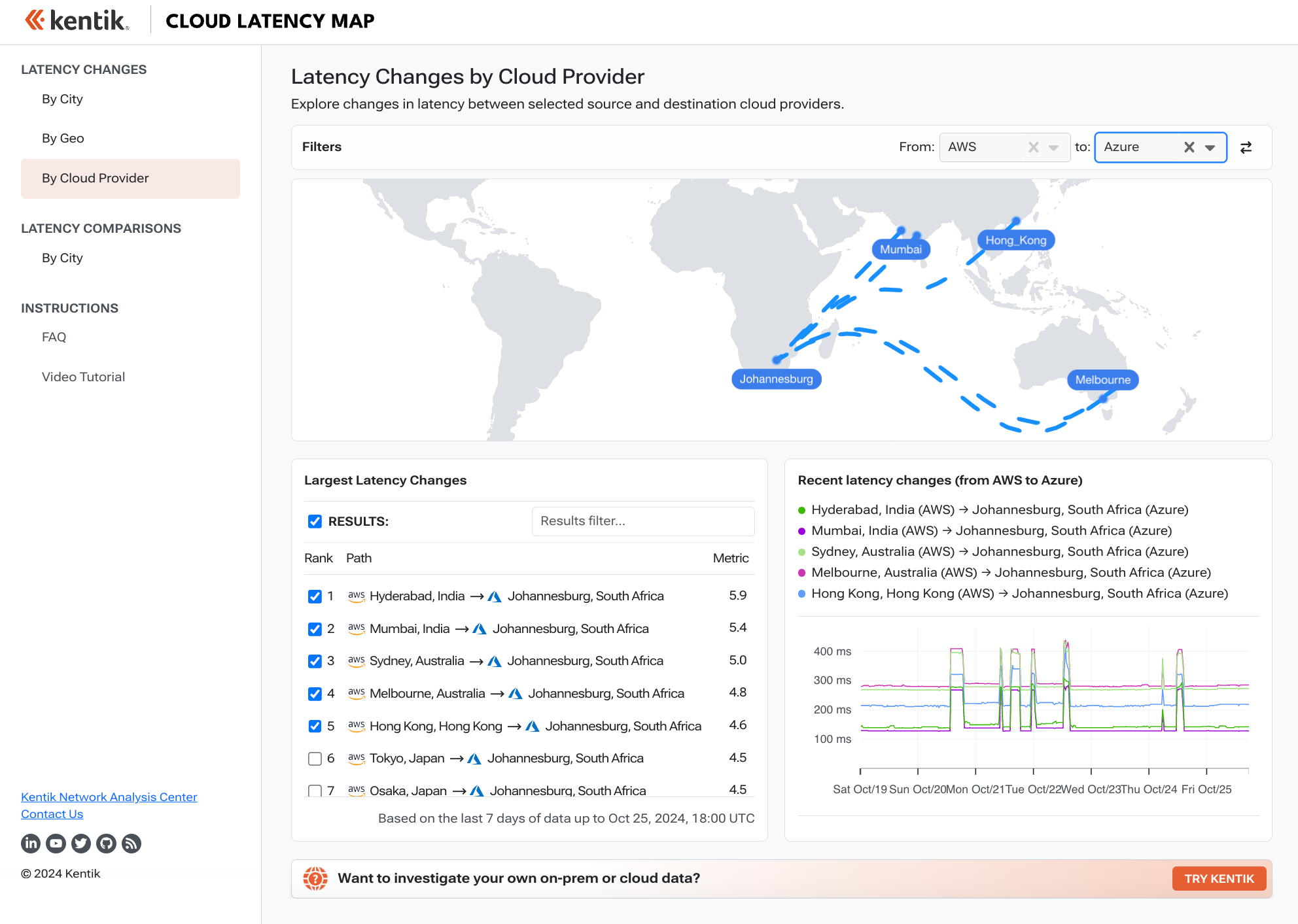
In the second component, Latency Changes, the Map can be used to explore measurements experiencing latency changes among the over 10,000 individual measurement series in the dataset. The user can choose to restrict the query by selecting a particular cloud, geographic region, or city as the source and destination. This allows the user to find any measurements experiencing changes to a particular city or cloud in the past seven days.
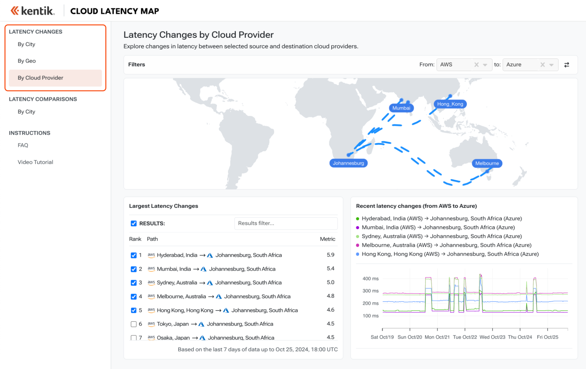
Let’s say there is a report of a fiber cut in a particular city. One can use the Map to check to see if any of the latency measurements to or from that city have experienced changes in recent days as a way of identifying a disruption. Any spikes in latency may have been caused by the infrastructure failure.
In the example above, latencies between Azure’s southafricanorth region in Johannesburg, South Africa occasionally jump by 100ms or more when going to Asia. We see this behavior in all of the cloud regions in South Africa and believe this is caused by traffic to Asia getting routed up the west coast of Africa vs a more direct route on the east.
Recent observations
So, what are some examples of interesting observations we’ve seen on the Map lately?
While there haven’t been any dramatic events like submarine cable cuts in recent days, there are always interesting changes appearing on the Map. Let’s take a look at latency changes that popped up involving AWS’s cn-north-1 region in Beijing, China.
At around 17:00 UTC on October 22, 2024, the Map reported increases in latencies from a variety of Google Cloud locations in Europe. It takes two to tango, so we don’t know from this data alone which cloud made the change that caused all of these independent measurements to increase at the same time.
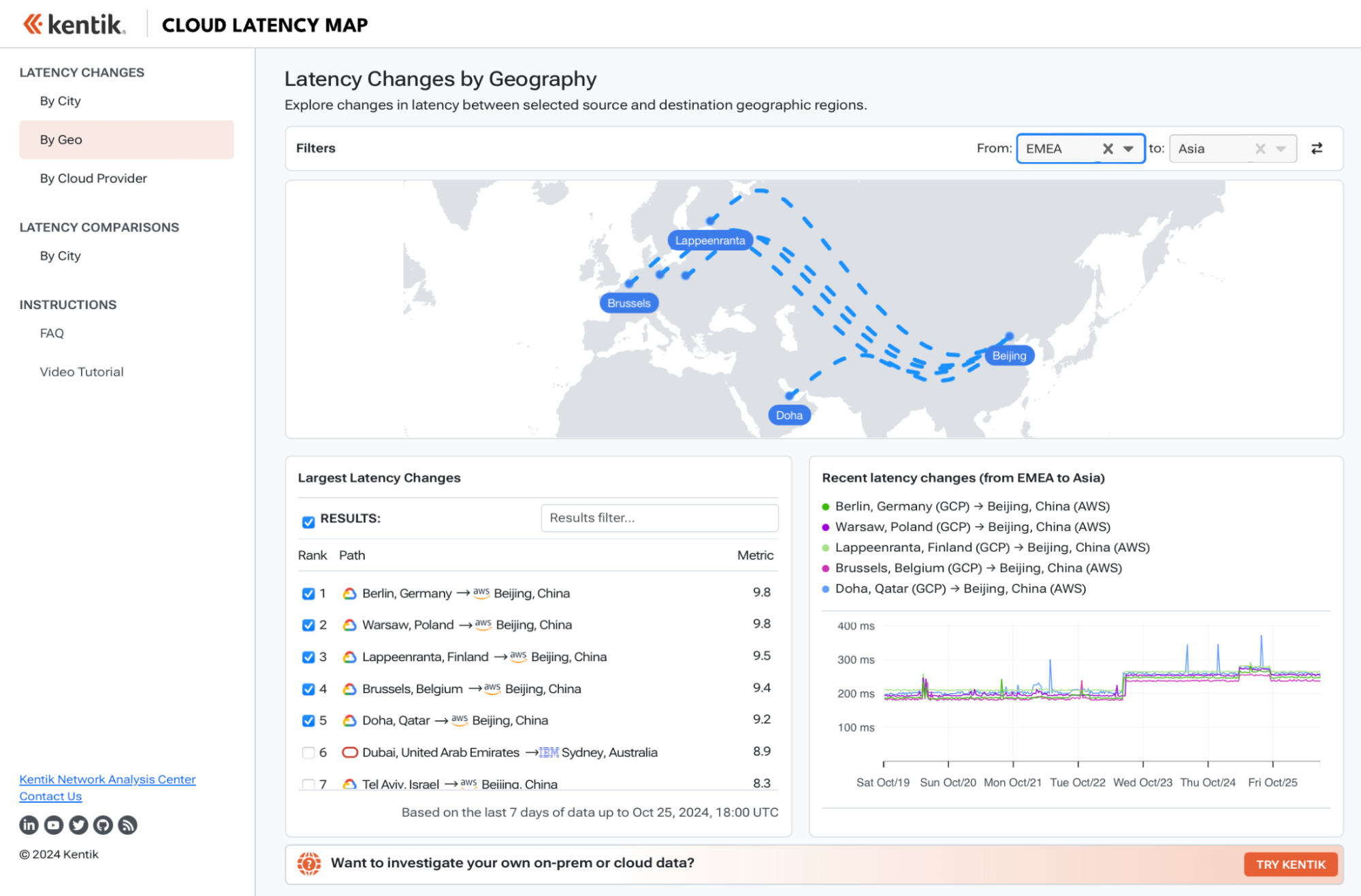
At the same time, the Map showed decreased latencies from Google Cloud locations in Asia. In fact, the measurements from Asia appeared to be bimodal, with the plot bouncing between two discrete populations of latencies. After the change, the bimodality went away, the latencies appeared lower and more stable.

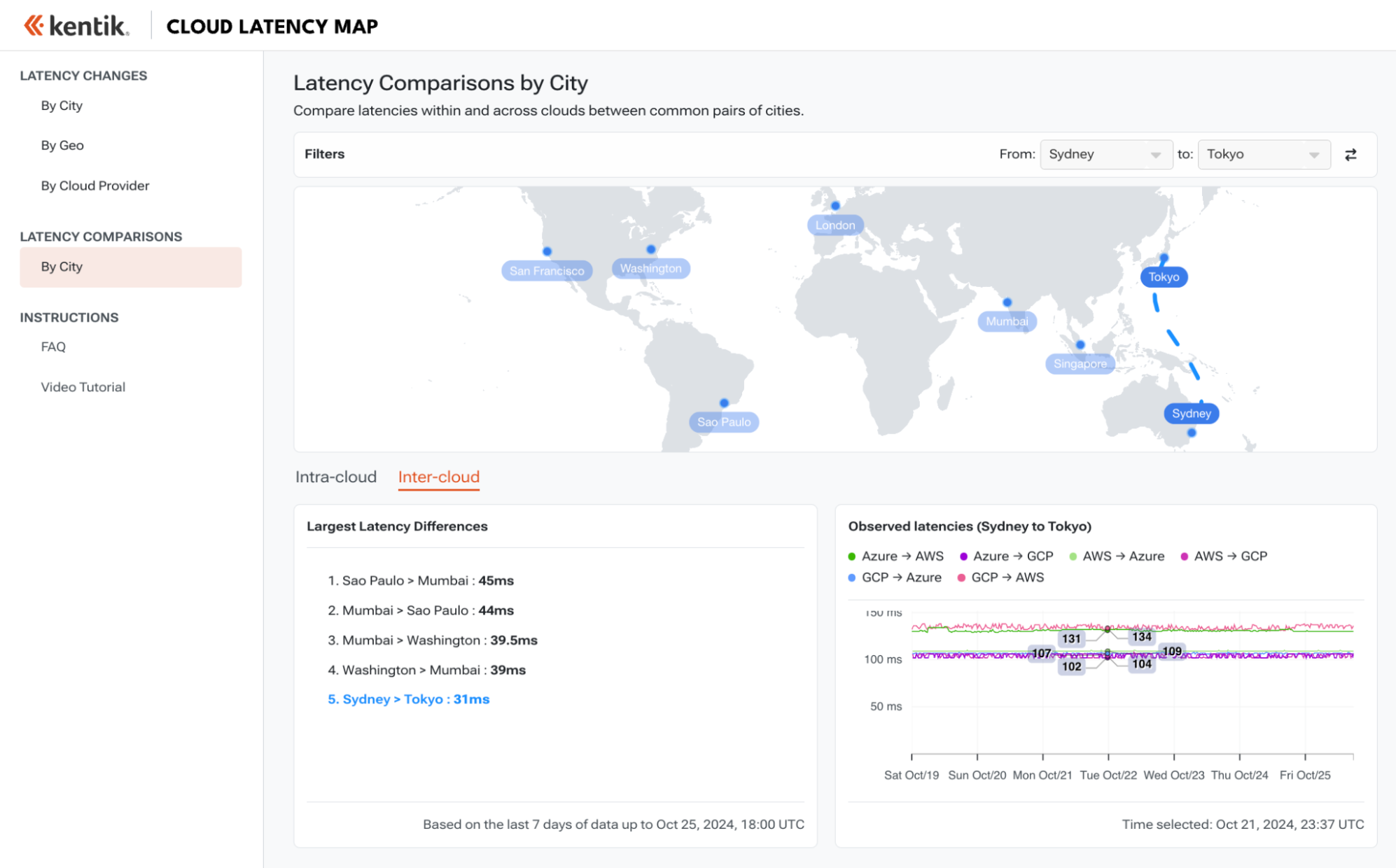
In the Latency Comparison section, many of the latencies exhibit a tight distribution and are quite stable, but the Sydney to Tokyo route has something worth analyzing. The path from Sydney to Tokyo requires the traversal of multiple submarine cables, the combination of which can greatly influence the overall latency.
Both Inter-cloud and Intra-cloud latencies along this route hover just under 110ms, except for the Azure→AWS and GCP→AWS routes which exhibit latencies of 131ms and 134ms, respectively. In other words, traffic from GCP and Azure in Sydney to AWS in Tokyo experiences latency of more than 20ms more than other cloud region combinations — including from AWS.
This is likely caused by how AWS in Tokyo accepts traffic from outside of its cloud. Traffic from non-AWS regions in Sydney is likely traversing a different combination of submarine cables to reach AWS in Tokyo.
Conclusion
Try it out! It’s free!
As the Map illustrates, it’s a volatile internet out there — even for rarefied traffic between the hyperscalers. Take a look around and see what you can find. The data is updated every hour, and we have a list of features we’d like to add to it in the future.
If you’d like to tailor this monitoring capability for your own organization, request a demo of Kentik’s synthetic monitoring.

