Summary
Managing network capacity can be a tough job for Network Operations teams at Service Providers and Enterprise IT. Most legacy tools can’t show traffic traversing the network and trend that data over time. In this post, we’ll look at how Kentik Detect changes all that with new Dashboards, Analytics, and Alerts that enable fast, easy planning for capacity changes and upgrades.
Better Tooling Brings Faster, More Reliable Capacity Decisions
Anyone who has ever done capacity planning for a network knows of the challenges this role brings. How do you figure out when your links, routers, switches, firewalls, and other network infrastructure are going to run out of capacity? In some cases, capacity is ignored until there is an issue because no one has the time to deal with it. 
There are, of course, traditional capacity planning tools available that collect counter data and let you set an alert on a static threshold. However, that restricts you to an interface-level view. It does not include business insights service providers need like total capacity to a given external network, total capacity in or out of a given market, or even what type of connectivity is being looked at (transit, backbone, paid peering, or free peering). It also does not cover the needs of large enterprises, like understanding WAN usage, ISP uplink capacity, east-west datacenter hotspots, and inter-datacenter link adequacy. In many cases, capacity planning is a completely manual process with complex spreadsheets to pull in the data, aggregate it, run statistics on it, and trend it over time. There has to be a better way, right?
In this blog post, we will take a look at how Kentik Detect can help gain integrated insights into network capacity, utilization, performance, and traffic composition to ensure the best service delivery at minimum cost.
Kentik Detect Capacity Analytics

Kentik recently added a powerful Capacity Analytics capability to the Kentik Detect platform. This feature allows the user to get a quick view of the link utilization across the network, automatically sorted or filtered to expose the most urgent issues, with projected capacity “run out” dates. To see this feature in action, click on the “Analytics” dropdown menu in the Kentik Portal and select “Capacity.”
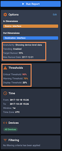
For this example, we will run the report with the default In / Out Dimensions settings of “Source Interface” and “Destination Interface.” We’ll change the Granularity setting to “Showing device level data” instead of “Showing site level data.” This will show the name of the device in the output instead of just the interface name. To look at trending data and run-out date projections, we’ll set the “Trending” switch to “Enabled.” Last but not least, we’ll set a date filter to show only the interfaces that are going to run out of capacity by the end of the year (2017-12-31).
For Thresholds, we’ll use the defaults of 90% for Critical, 70% for Warning, and 20% for Display (minimum utilization to appear on the report). We will leave the Time, Devices, and Filtering all to their current default settings which will analyze one week’s worth of data for all devices. Lastly, we click the blue “Run Report” button at the top to see the magic begin.

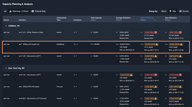
In the report output we can see there’s a section for each site (i.e. PoP or router group) we have defined in Kentik Detect. In the “Ashburn, VA” section we will focus on the second line for a device called pe1.iad.

This has a link called ae7 (an aggregated Ethernet bundle) which is a backbone type of link with 30 Gbps of capacity. Kentik automatically discovers the capacity of interfaces (including bundles) via SNMP. The astute reader will see that we have three different ways to analyze utilization: Average, 98th Percentile, and Max. Based on the thresholds that we set, we quickly see which links currently have warning and critical utilization levels in each of the three categories. The average appears to be okay, but looking at the 98th percentile and max levels, we can see we are approaching capacity.
If we look at the second line in the traffic columns, we can see how the traffic is growing over time. In this case, the MoM (month-over-month) growth rate is about 11% for the 98th percentile calculation and 10% for the maximum.
The last thing we will look at on this report is the projected date at which we will run out of capacity on this link. This is probably the most powerful part of the whole report as it gives us an estimated target date so we can plan to either shift traffic or have an upgrade in place by that date. In this case, the 98th percentile is showing a run-out date of December 11, and the maximum is showing December 6. An action plan is definitely needed by the beginning of December to avoid congestion on this interface. Most capacity planners would need very complex spreadsheets to uncover that date, but Kentik’s Capacity Analytics provides prioritized, automatic calculations for every interface in the network.
Pro-Active Alerting Based on Trend Data
Running a report is great, but what if we could get automatic, pro-active notifications when an interface is nearing its capacity? With Kentik Detect’s Alert Policies you can do just that. In fact, we have a pre-built example in our alert policy library to get you started. To access the feature, click on Alerting » Library and scroll down until you see the alerts below. Click the highlighted button to copy them from the library into your account’s active policy set.

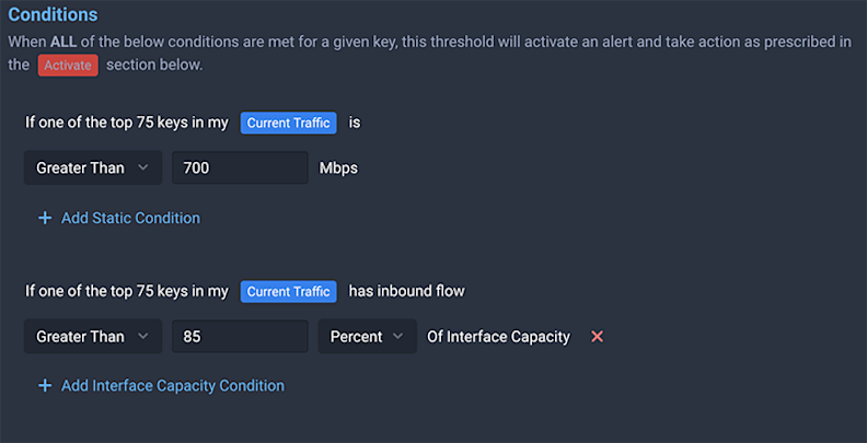
By default, these alerts are set to trigger if any interface has at least 700 Mbps of traffic and is at more than 85% utilization. You can adjust these settings to meet your needs by clicking on the alert to bring up the edit window, and then click the “Alert Thresholds” tab.

At the bottom of the Alert Thresholds page is a spot where you can configure how you want to be notified (email, Slack, Syslog message, JSON Post to a webpage, or PagerDuty notification). This gives you the ability to tie the alerts to a capacity management system you may already have in place.
One more thing you may want to adjust is the dashboard that is linked to any alarms that are generated. We will cover more about how to use the dashboard in the next section, but there is a Capacity Management dashboard that might make sense for this type of alert policy. To adjust this, click on “Policy Dashboard” on the “General Settings” tab.

Once you have an alert for an interface utilization nearing capacity, how do you tell the top talkers on that link? For enterprises, this could be useful for seeing if there is a misconfiguration or misuse that might be causing the bandwidth consumption. For service providers, this is helpful for seeing if a single customer or CDN is using the majority of the capacity on the link.

On the right side of the alert, you will see some action buttons. Click on the highlighted button to open this in the Kentik Data Explorer. When the Data Explorer loads, you will see a graph similar to the one we depicted, showing the total traffic on the link.

In order to dive deeper into the traffic, click in the “Group By Dimensions” field and add some additional details you would like to see. A good place to start is adding Source IP/CIDR, Destination IP/CIDR, and Destination Protocol:IP Port to see your top IP talkers on the link.
If you want to learn more about leveraging the power of the Kentik Data Explorer, check out our KB topic. For more details on how to tune our alerts to meet your needs, check out our previous blog post on configuring alert policies.
Capacity Planning Dashboard
In the previous section, we mentioned a “Capacity Management” dashboard. This can be really handy for a capacity planner to get a quick snapshot of the top links across the network and a view of their capacity. To access this dashboard, click on Dashboards » Capacity Management.

This dashboard is divided into sections by interface capacity (1G, 10G, 20G, 30G, 40G, and 100G) as well as by direction (source or destination). The default time window for the information is the past one day. At a quick glance the capacity planner can see what interfaces are nearing capacity as they scroll through the dashboard. As an added bonus, you can export the dashboard by clicking on the icon in the upper-right-hand corner.

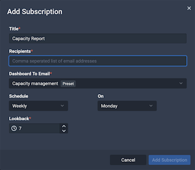
To really round out this feature, you can create dashboard subscriptions to get the output automatically delivered to yourself or your team via email on a schedule you choose. To set up a subscription, click on Admin » Subscriptions » Add Subscription and fill out the form with a report title, recipient email address(es), and delivery schedule.

Summary
As we have seen, the Kentik Detect platform gives capacity management teams a much richer toolset to head off congestion, plan and budget for upgrades, and prevent the fire drills that are common in many network operations workflows. If you are already a Kentik customer and have questions on how to get setup with Capacity Analytics and Alert Policies, get in touch with our Kentik support team. If you are not currently a Kentik customer but want to benefit from these planning tools, contact us today to request a demo or start a free trial.
